Do some research into contemporary street photography. Helen Levitt, Joel Meyerowitz, Paul Graham, Joel Sternfeld and Martin Parr are some good names to start with, but you may be able to find further examples for yourself.
- What difference does colour make to a genre that traditionally was predominantly black and white?
- Can you spot the shift away from the influence of surrealism (as in Cartier-Bresson’s work)?
- How is irony used to comment on British-ness or American values?
Research
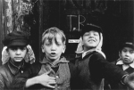
Helen Levitt
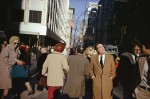
New York August 31, 1913 – March 29, 2009
Helen Levitt was active from the late 30s to the 90s and during that period transitioned from B&W to colour. In the 60s through to the 80s she used the same dye transfer process loved by William Eggleston. Her photos are of ordinary people: kids playing, families, business men.
Joel Meyerowitz
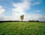
New York March 6, 1938 –
-

-
New York City, 1963
-

-
Land, Provincetown, 1976
-
According to his Wikipedia entry, after being inspired by Robert Frank, Meyerowitz started photographing the streets of New York city in B&W. After alternating between B&W and colour, he permanently adopted colour in 1972. Among many other achievements he became famous as the only photographer allowed to document the aftermath of the 2001 attacks on New York city.
Paul Graham
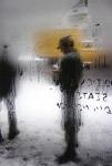
Stafford, UK: 1956 –
-

-
Paul Graham: From A1 – The Great North Road
-
-
Paul Graham: From Troubled Land 1984-1986
-

-
Paul Graham: From Does Yellow Run Forever 2011-2014
According to the short bio on the Pace Gallery website, Paul Graham is a British photographer living and working in New York City. In 1981, Graham completed his first acclaimed work, A1: The Great North Road. His use of color film in the early 1980s, at a time when British photography was dominated by traditional black-and-white social documentary, had a revolutionizing effect on the genre.
Joel Sternfeld
New York 30 Jun 1944 –
-

-
Joel Sternfeld: Washington D.C., August 1974
-

-
Joel Sternfeld: Nags Head, North Carolina, (#1), June-August 1975
-

-
Joel Sternfeld: New York City, (#1), 1976

Joel Sternfeld: McLean, Virginia, December 1978
According to the Luhring Augustine gallery website, Sternfeld is known for large-format colour photos that record roadside America as initiated by Walker Evans in the 1930s. His photos tend to be of ordinary people on the street, at the beach and sometimes show humour such as the photo on the left of the fireman picking a pumpkin while a building blazes behind.
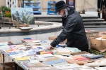
Martin Parr
UK 23 May 1952 –
Martin Parr is a British documentary photographer specialising in images that take an “intimate, satirical and anthropological look at aspects of modern life” (Wikipedia). In 1994 he became a member of Magnum Photos. Badger (2014) remarks that Parr has embraced “a fundamental part of what photography does best – take us there” – he has found a way to “contemplate our present and our past”.
William Klein
US 1928 –
-

-
William Klein: Untitled
-

-
William Klein: Untitled
-

-
William Klein: Gun 1, New York, 1955
According to the Artnet site:
“William Klein is an American artist known for his unconventional style of abstract photography. Although similar in subject matter to other documentary photographers such as Diane Arbus and Saul Leiter, as well as fashion photographers Irving Penn and Richard Avedon, Klein’s images broke away from established modes through his use of high-grain film and wide angles to create his often out-of-focus black-and-white prints.”
Rather than being impersonal and from a distance, his photos tend to be relatively close to his subjects and it’s very clear that they usually know they are being photographed.
Saul Leiter
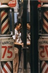
Pittsburgh 3 December 1923 – New York 26 Nov 2013
-
-
Saul Leiter: Snow, 1960
-

-
Saul Leiter: Parade, 1954
-
-
Saul Leiter: Haircut 1956
According to the Howard Greenberg Gallery website Leiter moved to New York to study painting at the age of 23. He became interested in photography via his friendship with W. Eugene Smith. He started with B&W, however by the 1950s (actually, 1940s according to Harrison 2015) he began to work in colour as well, making him one of the earliest adopters of colour for art photography.
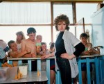
Eamonn Doyle
Dublin 1969 –
 According to the Michael Hoppen Gallery website, Doyle graduated with a Diploma in Photography from IADT in 1991. After spending the majority of 20 years in the music business, he returned to photography in 2008. “Most of Doyle’s work is produced in and around the Dublin city centre where he has lived for the past 20 years, and these images prove that some of the best photographs can be taken on your very own doorstep. ”
Doyle has a particular style. Many of his B&W images are quite imposing and dramatic, while his colour images tend to be quieter and often show the backs of people.
What difference does colour make to a genre that traditionally was predominantly black and white?
Colour had both a technical an aesthetic difference. On the technical side, at the time of the early users of colour, the process for developing and printing colour film was complex and expensive – certainly beyond the capabilities of individuals. Additionally, B&W films had developed to be relatively fast – ISO400 was available, compared with the earliest Kodachrome which was originally ASA25, then 64 came later. This had the effect of restricting users to slower shutter speeds and/or wider apertures.
On the aesthetic side, colour was seen by many as vulgar because it was associated with advertising. But for some, this was precisely the attraction. William Eggleston, an adopter of colour from the 1960s said in an interview with the Whitney Museum (2009) that he “wanted to see a lot of things in colour because the world is in colour”.
Can you spot the shift away from the influence of surrealism (as in Cartier-Bresson’s work)?

Henri Cartier-Bresson: Roman Amphitheater, Valencia, Spain, 1933
According to the article Photography and Surrealism from the Metropolitan Museum of Art (2004), the surrealists were active from the mid-1920s and photography came to play a central role not only due to “the medium’s facility in fabricating uncanny images”, but also due to the ability to manipulate and transform images “through the prism of Surrealist sensibility” so that they were radically different from the original.
Badger (2014) puts it this way: “They [the Surrealists] were intrigued by photography, partly because of its mechanical nature, and partly because of its innate ability to slip expectedly between reality and unreality”.
Man Ray is often cited as a leading surrealist due to his careful manipulation, especially at the printing stage, however the Surrealists also appreciated the work of what we might otherwise “straight” photographers such as Eugène Atget. In his “photographs of the deserted streets of old Paris and of shop windows haunted by elegant mannequins, the Surrealists recognized their own vision of the city as a ‘dream capital’, an urban labyrinth of memory and desire.”
According to Henri Cartier-Bresson (1908–2004) (2004), Cartier-Bresson began to make photographs in 1931 that reveal the influence of both Cubism and Surrealism – “bold, flat planes, collagelike compositions, and spatial ambiguity—as well as an affinity for society’s outcasts and the back alleys where they lived and worked.” By 1952, his landmark publication The Decisive Moment, had shown that he’d formed his own direction. In that sense, we could see Cartier-Bresson as bridging the “golden period” of the Surrealists (generally thought to be from the early 30s through to the 60s, although there is in reality no end date).

Alex Webb: Iquitos, Peru 1993
Even though Cartier-Besson had moved on by the early 50s, surrealism has never really died, but re-appears now in then, such as the example on the left by Alex Webb from The Suffering of Light (2011).
How is irony used to comment on British-ness or American values?

Tony Ray-Jones: Derby Day 1967
From the OED: “Irony: the expression of one’s meaning by using language that normally signifies the opposite, typically for humorous or emphatic effect”.
Martin Parr as well as Tony Ray-Jones (see left) use irony by identifying scenes showing odd behaviour. A classic example is from Parr’s Last Resort series showing the woman sun-bathing on concrete in front of some sort of earth-moving equipment. Why precisely at that spot when there’s a sandy beach right beside her? Parr shows people relaxing at a declining seaside destination (New Brighton), but in a “clear-eyed, unsentimental view and sharp, lucid colour, that ensured a mixed reaction to the work” (Badger 2014:161).